How to customize charts in ChartBase
April 15, 2022 — 3 min readchartsnotionchartbasecustomization

Introduction
In the previous article, we learned how to create a new chart in ChartBase and how to embed it in your Notion page. In this article, we will take a closer look at the customization options available in ChartBase and how you can use them to create beautiful and interactive charts.
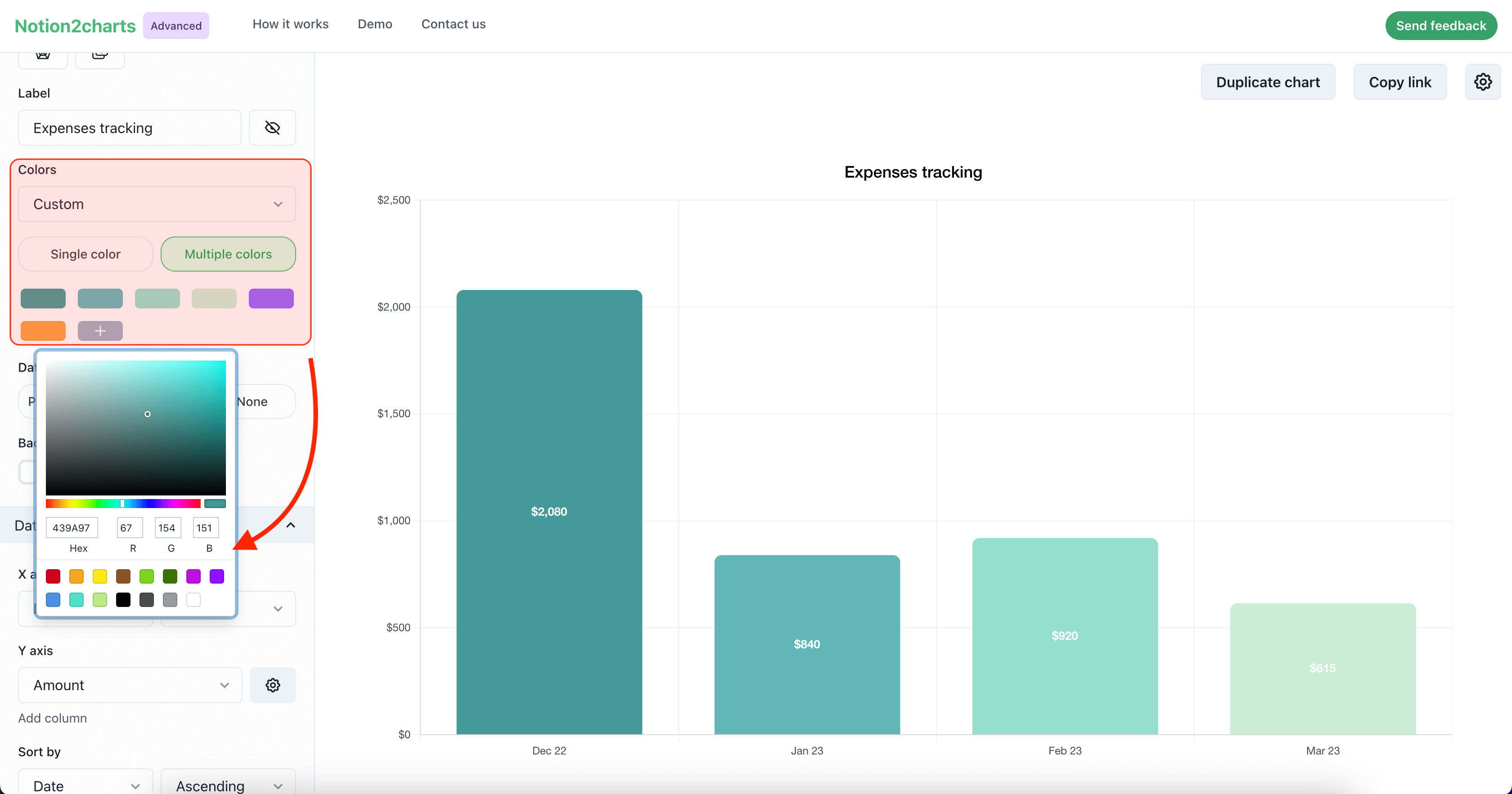
Customizing chart colors
One of the first things you may want to customize in your chart is the colors. ChartBase offers a range of pre-defined colors that you can choose from, or you can create your own custom color scheme.
To change the color scheme of your chart, click on the "Colors" tab in the chart builder and select a pre-defined color scheme from the dropdown menu, or click on the "Custom" option to create your own color scheme.
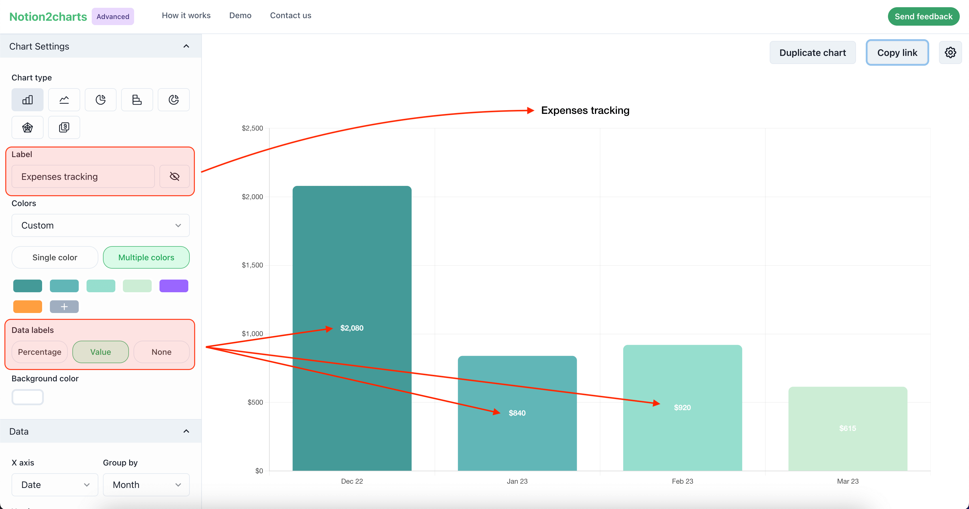
Customizing chart title
Another important aspect of chart customization is the title. ChartBase allows you to customize your chart title, as well as the labels of the data series in your chart.
To customize the title of your chart, locate the label input in the chart builder and enter the desired label.
To change the format of your data labels, select the "Data labels" tab in the chart builder. From here, you can choose the format you want to use for your data labels, such as percentage or number. You can also choose to hide your data labels altogether if you don't want them to be displayed on your chart.
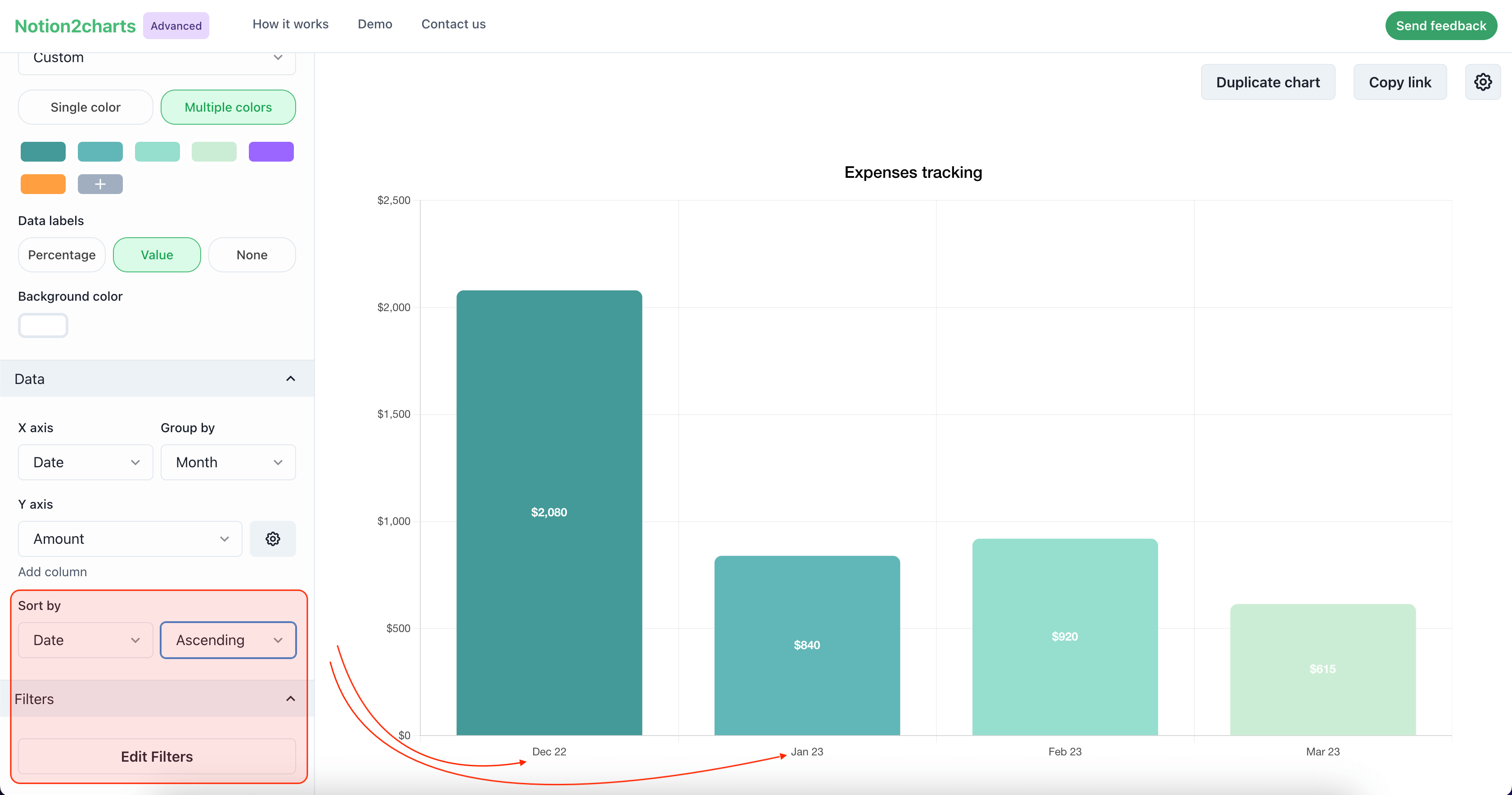
Adding filters and sorts
In addition to customizing the appearance of your charts, you can also customize their behavior by adding filters and sorts. This allows you to focus on specific data points in your chart and to rearrange the data series in a way that is most meaningful for your analysis.
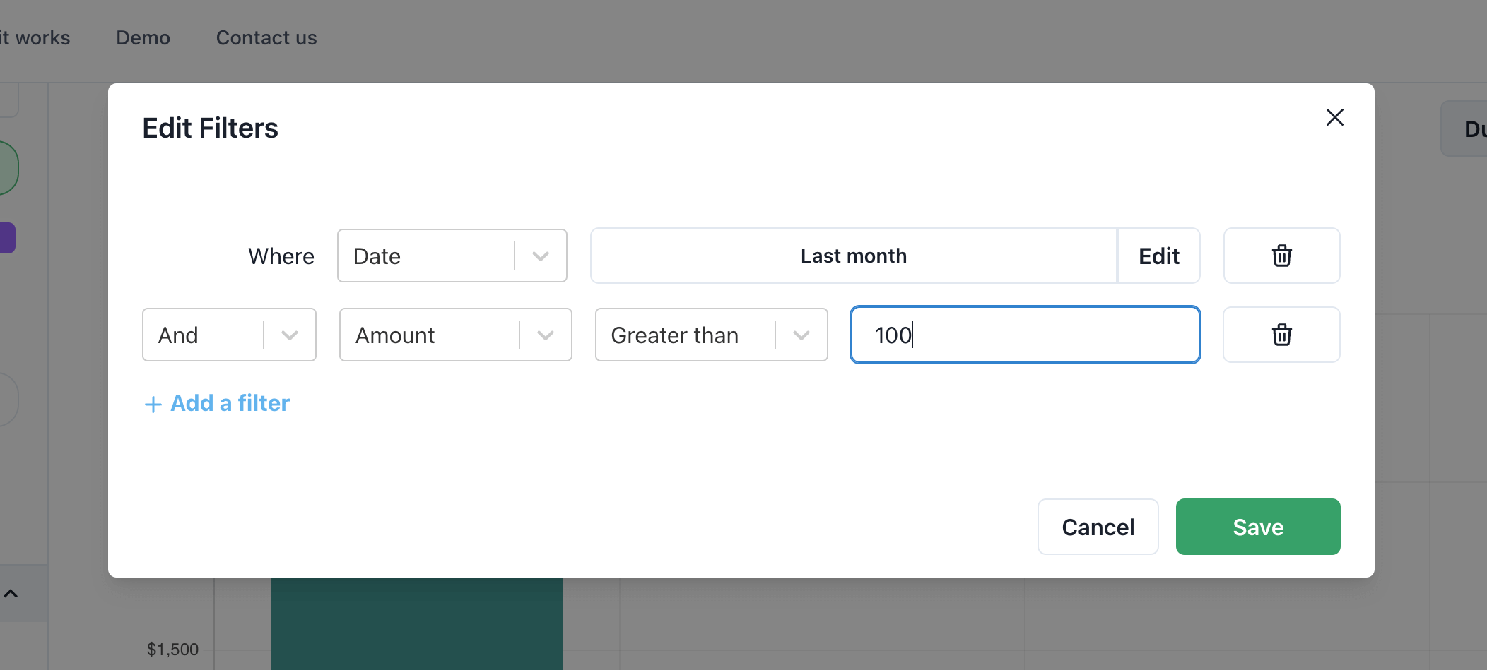
To add filters and sorts to your chart, click on the "Filters" tab in the chart builder and select the columns you want to filter or sort by using the dropdown menus. You can also specify the conditions for the filters and the order for the sorts.
Conclusion
In this article, we learned how to customize the appearance and behavior of your charts in ChartBase. We looked at how to change the color scheme, customize the labels, and add filters and sorts. With these customization options, you can create beautiful and interactive charts that allow you to better analyze and understand your data in Notion.
Latest Posts
Notion Charts: 7 Ways to Make Graphs in Notion
We share the best ways to turn databses into Charts - from ChartBase to LucidChart to GRID, we cover it all.
How to Create Charts in Notion: A Step-by-Step Guide
In Notion, you can't create graphs or charts from tables yet. In this article, we will show you how to create beautiful, dynamic charts from your Notion database using ChartBase, a tool that allows yo